Needing nursery inspiration? Our tips to creating that dream nursery...
Some of you who have been following a while, might have noticed I'm a bit of a time poor mess some days. With the arrival of each of our babies, I couldn't imagine life getting any more hectic but somehow it did. So Ruby basically got to 9 months old before I even realised I had never updated her nursery. I'd spend hours during midnight feeds looking through nursery inspiration. And yes she had a cot, feeding chair, change pad etc and everything was functional. But there were still blank hooks from where I'd taken down photos and custom posters of PJ's and never replaced them.
I'd started working on our new nursery range straight after Ruby was born and had enjoyed looking at different bedroom styles and ideas. But I've never managed to put them in practice. That was until I had the idea to do our nursery range launch as an Instagram live, and held a photoshoot in Ruby's bedroom. Eeek it was time for me to get it together. Luckily I have friends that are far better at room styling than me. I've known Courtney from Talbot Design since we were teenagers at school and with a few key pieces of advice and a very small budget I was able to take Ruby's room from hand-me-down survival mode to show stopper. Here are some of the tips Courtney shared with me....
The tips and tricks for some nursery inspiration...
Not all feeding chairs are created equally:
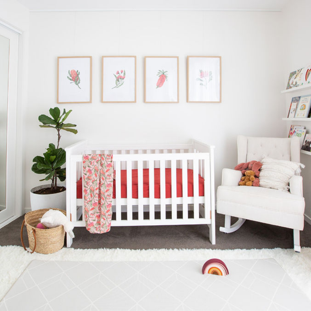
 Whether you bottle feed or breastfeed, in those early days baby's need plenty of it. And you need somewhere comfortable to sit. I had a blue circular chair from when the boys were babies and while I loved it, it had a low back and wasn't the most supportive. I swapped it out for a tall back rocker (I borrowed from a friend) and the look of the room changed instantly. The height balanced out the room and the light beige colour created a beautiful neutral look. Plus it was better for my back and soothing for Ruby to gently rock. I wish I'd gotten one sooner.
Going green: add a plant
 So full confession, in the photoshoot I grabbed one of my fiddle leaf figs from the patio and put it in Ruby's room. But I'm way too scared to keep a real plant in her room as I learnt the hard way from the boys covering my floors in dirt. So its getting replaced by a faux version because I love the look so much. The pops of green add a fresh feel to the space and worked well with the neutral base colours we were going for. This way we could add pops of colour through our sheets, blanket and wall art to add interest to the space.
Window coverings are important

We have roller blinds to keep out the dreaded sun and reduce those 4:30am wake ups, but lets be honest. They hardly add much to a space when it comes to atmosphere. To give Ruby's room that light and airy theme, we added some DIY sheer curtains from Spotlight. Hands down this made the biggest difference to the space. Once they were up, PJ (3) asked if we could do his room next because he loved the feel of the space so much. Bless. Yes, we will baby boy xxx
Layering is everything, even on the floor:
 As I mentioned, interior design is not my area of expertise. Courtney explained to me that because our floor space was so big and dark it was sucking a lot of the light from the room. Adding a soft white furry rug, had the amazing effect of creating a light and bright feel that was also cuddly and cozy. We then paired this with a play mat on top which popped against the white backdrop. Such a win (PJ also wants a rug in his room too).
Books, Toys and Wall art
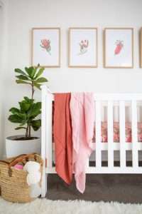
Here is where we add the colour. Because we were using Ruby's room as a neutral base to showcase all her nursery items we made sure flooring, plants, chair, furniture etc were very neutral. Lots of whites, grey and beige. So all of our colour came from accessories. The entire look of Ruby's room can change by swapping out the Australian floral wall art to the Animals or Construction. Personally at the moment I'm digging the Floral art, terracotta sheet and Rainbow quilt over the chair but I've been changing it up. Going through the kids books and moving certain coloured books to the front or putting favourite toys on display is also a great way to add pops of colour to your space.

So here is what I learnt. I wish I'd gone to these final few steps when Freddy was a baby. Once I'd put all my nursery inspiration pics together it was obvious these were the elements I was missing. It would have been far easier to just change up sheets and wall art between kids to then refresh the room and give it a whole new feel. But hopefully our new nursery range helps other busy time poor mothers to add those finishing touches to their baby's nurseries that they crave.
